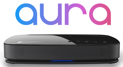
Our FVP4000T has been up and running for two weeks now. There are things about it which are a definite improvement on our old PVR 9150T: picture and sound quality (obviously!), catch-up TV offerings and the fact that it seems to get the starts of all programmes now.
However, I thought this would be a good time to come up with a wishlist of a few things which I think would improve it further:
1) The option to take away the live TV picture in the background of windows such as the schedule and recorded programme listing. It's not an issue so much for me, but it's a real problem for my partner.
2) Smaller entries on the recorded programme list page, to reduce the amount of scrolling required. (Ideally, one line per programme, with a single thumbnail screen on the the right for the currently highlighted entry.)
3) On the recorded programme list, show a thumbnail of a scene say 2 or 3 minutes into the recording. At the moment, most thumbnails just show the first frame of the recording, usually an image of the TV channel ident, which is useless.
4) Again, on the recorded programme list, jump to the oldest recording by default once you're in the series view. If you're watching a series, why would you want to start with the most recent episode and work backwards?
5) Do something with the LEDs to show the difference between "on and recording" and "in standby and recording".
I know I probably won't have changed anything by posting this list, but at least it's got it all off my chest!


