Hi all,
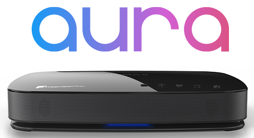
I've just purchased a FVP-4000T which I think was one of the last items in stock pre-5000's as out of the box, the unit had the new software UKTFAE 1.03.39, the updated RML-08 Remote & underneath-unit LED lighting rather than LED's on the front right-hand side as the first models did.
I have to say I'm pretty impressed with the unit as a whole, and even though I've only had it a couple of days to eventually replace a Freesat HDR-1000S the user experience is very good, though a bit different from the HDR-1000S and the difference in remote layout takes a bit of getting used to.
That said, there are a few features of the FVP-4000 (and 5000?) which seem counter-intuitive compared to the HDR-1000S, which I'd like to comment on and put forward for a wish list, which might hopefully be addressed in a future software update to further enhance the user experience:
Start Recording On-Screen Reminder
By far the most annoying feature of the FVP-4000T I've found so far is when a previously scheduled recording actually begins, a reminder appears on screen via the FVP-4000 to inform the user the recording has started. The huge black rectangular square appearing at the top of the screen is extremely distracting if the viewer is trying to concentrate on a previously recorded programme being played.
Perhaps OK if it's a light programme such as "Eggheads" or "Homes Under the Hammer", but not so good if a huge black rectangle appears during a tense drama such as "Shetland", which seems a superfluous reminder to inform (for example) "Gogglebox" is starting recording on Channel 4.
It's ruddy annoying when you're concentrating on a programme, and shouldn't be needed with a 3 tuner unit as there's less scope for programme conflicts.
Skip Backward/Skip Forward
When viewing a recorded programme, in order to skip backward or forward on the HDR it was a one button remote press via the top |<< or >>| buttons.
https://www.humaxdirect.co.uk/accessories/rm-i08u.html
On the FVP remote it's a trickier affair, as the Play > needs to be engaged, followed by the < or > near the OK button half way down the remote in order to do the same action.
If the two buttons on the FVP remote could be programmed to function the other way round (ffwd x 2, x4 etc via the > near the OK button) & the skip forward/backward feature near the play button, it would make the remote far more user intuitive.
Accessing Recordings
The RML-08 remote on the FVP has a "direct recordings" button which is necessary, but after selecting the programme to be watched, if in "chase" mode the first on-screen option is to "Watch Live" (whilst recording).
A couple of times I've mistakenly selected this rather than "Play this Recording", which requires an additional press of the 'down button' then OK.
A minor niggle, but again a minor annoyance as I've begun watching the programme being recorded live without realising it was being recorded from the beginning!
No "i" button
A right old faff to find out the synopsis of what's being recorded without this button, but if the ^ near "OK" on the RML-08 could be employed to give a one-button press (with brief synopsis) for on-screen display rather than just the title of the recording, it would be much better for the end user as a quick way to find out which episode is being watched if from series link.
Subtitle button
HDR-1000S remote required one button press to toggle Subtitles on/off, with a second press only necessary for secondary subtitle language if available
FVP-4000T remote requires two button presses to toggle Subtitles on, first button press displays "Subtitle-Off", second button press to "Subtitle-English"
Again, it seems over-complicated compared to the HDR-1000S & if this could be simplified it would be helpful.
I'm unsure if it's possible to fix these (mostly) minor issues in a future SW update (except for the "Start Recording On-Screen Reminder" which is a major pain), but for me if these issues were addressed it would make the box perfect!


