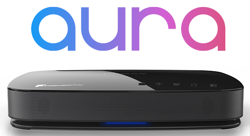
Are HUMAX likely to take on board any suggestions to improve the User experience, especially around the EPG?
My Humax Forum » Freeview HD » FVP 4000T, 5000T
User Experience
(10 posts)-
| Tue 17 Nov 2015 20:58:30 #1 |
-
Presumably there'll be certain constraints imposed by the Freeview Play specification. What changes would you like to see?
| Tue 17 Nov 2015 23:22:56 #2 | -
1. Given that there is no "info" button (a massive oversight in my opinion), they could make more use of the "+" key - the things it seems to do could be accessed elsewhere and the "+" could effectively become the "info".
2. When you go to the EPG, every current programme takes the whole width of the screen (even if it's only 5 minutes duration). When you move to the right, the screen is displayed better with programmes having the correct visual length. It would be better not to have the first screen.
3. Each programme in the EPG has its name with the times displayed underneath. It's not necessary to display the times - you can see visually when the programme is on. Removing the times would enable more channels to be seen in the EPG than the current six.
4. When in the EPG, show the current programme (ie. the one you were on before you went into the EPG) in one of the top corners of the screen. (Like on SKY.)
5. By doing 3 + 4 above, there would be some space above the channel listings on the EPG - use this area to dynamically display more info about the currently highlighted programme, or display more info about the currently highlighted programme in this area by pressing the "+" key.
There are other improvements around seeing what has been scheduled to record. It's worth looking at SKY and YouView to pick up some good ideas.
However, I like the box - it can record more programmes while you watch, it boots quickly and the remote is responsive. Unfortunately the EPG interface seems to have been designed by someone who never uses a modern TV!
| Wed 18 Nov 2015 8:42:27 #3 | -
IMO....
The initial now & next screen should be scrapped or made optional.
I would prefer to keep the times.
Fix how highlighted programs often overlap the following program making it impossible to see what's up next on that channel.
Channel logos a bit small, sometimes hard to see. Add a label?
Don't agree with TV being shown in the EPG - waste of space.
"display more info about the currently highlighted programme in this area by pressing the "+" key." Like this idea, does anyone actually use the genre filter??| Wed 18 Nov 2015 9:55:30 #4 | -
I'm guessing this EPG is probably influenced by which YouView features FVP were able to include, and which they couldn't, and other things with which they hoped to distinguish the EPG from YouView. Plus of course the Humax layer - seems to me I recognise the introductory Now/Next screen I hate!

FVP Technical Summary - terse, but it gives a few clues to possible constraints, such as "basic accessibility" - this was one of the BBC Trust requirements for YouView and one that was very well fulfilled. FVP will probably have similar obligations - might explain some things like the area of screen devoted to a single programme.
| Wed 18 Nov 2015 10:24:33 #5 | -
JamesB - 36 minutes ago »
I'm guessing this EPG is probably influenced by which YouView features FVP were able to include, and which they couldn't, and other things with which they hoped to distinguish the EPG from YouView. Plus of course the Humax layer - seems to me I recognise the introductory Now/Next screen I hate!
FVP Technical Summary - terse, but it gives a few clues to possible constraints, such as "basic accessibility" - this was one of the BBC Trust requirements for YouView and one that was very well fulfilled. FVP will probably have similar obligations - might explain some things like the area of screen devoted to a single programme.
http://www.digitaluk.co.uk/__data/assets/pdf_file/0007/87685/Freeview_Play_Technical_Summary_v6.0_2015-09-24.pdfThe home screen (which I also hate, if you want the guide it's only 1 button away anyway) is down to Freesat.
| Wed 18 Nov 2015 11:02:03 #6 | -
I'd like the search button transformed into a recordings button.
| Wed 18 Nov 2015 11:17:38 #7 | -
The home screen (which I also hate, if you want the guide it's only 1 button away anyway) is down to Freesat.
True, its reincarnation in the FVP EPG may not be down to Humax - Freesat's owners being FVP partners. Thanks for the clarification.| Wed 18 Nov 2015 11:20:46 #8 | -
I suppose people will always have different preferences, I like the idea of a small screen in the top right of the EPG, enabling space to the left for info about the current programme in the EPG. I definitely think displaying the times of the programmes under their descriptions is unnecessary and wastes space, however the lack of a proper info button is the biggest problem - so adapting the "+" button would help.
| Wed 18 Nov 2015 20:28:11 #9 | -
The Technical Summary has this:
User-facing functionality
Enhanced 7-day linear EPG.
Backwards EPG for 7 days, providing deep links into OD players.
Access to OD players.
Additional programme information (enhanced EPG data).
Connected red button (IP-enhanced interactive services).
Content search and recommendations, as development features.
Basic accessibility features.
Full Freeview+ capability in PVR devices.Elsewhere there's a mention of the potential for second-screen devices.
So it sounds like there'll be an app, along the lines of the FreeSat and YouView apps. Enhanced programme data may be part of the app remit, instead of being called up with an 'i' button press.
| Wed 18 Nov 2015 21:07:36 #10 |
Reply
You must log in to post.


