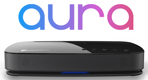
I have never liked the Freeview guide format used on this machine.
Most annoying is the way the current programme box automatically expands and covers the following programme, it is far to easy to mistakenly assume that (at first glance) there is no other programme in that time slot. A far more elegant way would be to reduce the width of the channel bands to accommodate an information box at the top of the screen and to just highlight the current programme. This works on other Humax devices so why not this? The current guide is just so clunky. Also, the present method of accessing programme information is frustrating! Why not just have the option to press the magnifying glass button (search) while watching a channel to immediately access the programme information directly? This is the logical button to use. That way the same button , when pressed from within the guide, can still act as a search button. Search/closer look/information are all easily associated with the magnifying glass icon.
The other thing that I find annoying is that, after an automatic channel scan, I get no options for selecting channels based on signal strength or regional variations. This option is available on the cheapest of cheap set top boxes. Without it, as I pick up from two transmitters, an auto scan produces poor results and I have to manually scan the correct frequencies.
Admin edit: Moved to FVP 4000T open forum.


