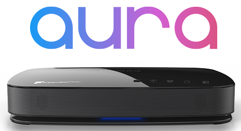
I recently replaced Sky+ with the Humax HDR-1000S because I was fed up paying for stuff I don’t use. Please tell me if I’m missing a trick here but:
I have to get a Voice of Customer before I specify the things I do to make sure people get what they want, remotes aren’t exactly rare so you would think Humax would ask people before designing one.
1. The aim must be for one button press for the important functions and toggles rather than single function
2. If you’re looking to pause (phone calls etc) then you want a big button to press, and the same button to go again. Even the OK button with now & next on the ! button.
3. Combine the fast forward and rewind (or skip) with the OK button arrows.
4. The Colour shortcuts don’t seem to be used for anything (except the BBC red button)
5. Deleting recordings should be one button press
6. Favourites should be one button press
In the EPG
7. Basically you shouldn’t have to think where things are, it should be intuitive. I wade through it, my wife’s ready to launch the remote at the TV.
8. Select HD only in the guide should be one button press
9. Long menus are difficult to navigate and I only use limited functions. It should remember the last selection (favourites etc)
But… really I’m pleased with the picture quality, the quiet performance, the range of channels and the overall build quality seems good.


